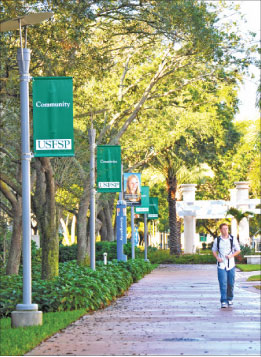
USFSP’s new logo adorns banners all across
campus. University officials believe the new logo
will help define the campus’ independent status.
Robbie Crowley
Campus & Beyond Editor
USF St. Petersburg began the 2011 spring semester with a new logo that incorporates all five initials of the university: USFSP.
Phillip Gary Design, a St. Petersburg-based firm, worked on the new logo, costing USF St. Petersburg $475, which was funded through the Division of External Affairs.
The new logo developed quickly, and did not seem to be in official planning as of last semester.
In September, Assistant Director in the External Affairs office, Melanie Marquez, said there were no plans for official change at the time.
The first signs with the new logo were implemented over summer 2010, but the university called them “visual images” rather than official logos. The official change then came in January 2011.
“All future signage will incorporate the new logo,” said Helen Levine, regional vice chancellor for External Affairs. “The replacement of older signage will occur on an as-needed basis as budgeting allows for the upgrades.”
Upgrades to campus signage have cost about $16,000, according to Levine.
“The logo’s design is intended to create more awareness of USF St. Petersburg’s status as an independently accredited institution within the USF System,” Levine said. “The new design of the logo expresses USF St. Petersburg’s unique position within the USF System.”
The change to the logo is slight, but will affect the entire campus. The change does not only affect signage around campus, but it also changes the letterhead and all paper documents with the USF St. Petersburg logo. The logo change is effective immediately, but departments are urged to use all materials with the old logo first before ordering new materials.
“As the community and prospective students learn more about our institution, they will see the comprehensive academic opportunities and community engagement USF St. Petersburg fosters,” Levine said. “The new logo helps the university’s constituents understand the institution as a whole and its offerings.”
The logo change marks one of multiple ways USF St. Petersburg is working to establish itself as a distinct university with more of a campus community. The completion of Residence Hall One and Harborside have been major steps in recent years, and the completion of the new student center will enhance this with more student housing, a food court and USF St. Petersburg’s first health clinic beginning in fall 2012.


Really? They’re charging us more for tuition and they’re making new logos? Great to see they’ve got their priorities straight.